Introduction
The digital marketing industry is booming. Big brands and companies are constantly putting efforts to be the finest in the market by using several marketing strategies. In all of these strategies, the customer is at the center. That is why marketing and product leaders spend most of their time polishing each touchpoint with the customer. In the online era, where you don’t have the opportunity to physically greet and talk to your customers, sending a single or a series of Welcome Emails is the most effective and proven strategy to build trust with your users.
This blog is all about welcome emails with some good content and design ideas from the industry.
What is covered?
- What is a Welcome Email?
- Why is a welcome email important?
- Does welcome email improve open rates?
- How to write a welcome email?
- What are the best welcome email examples?
What is a Welcome Email?
A welcome email or a message is the first email after the signup confirmation, where generally brand starts introducing their product & services. The first email can be just a simple greeting, followed by a series of emails at set intervals to create more awareness about the product and services. Because welcome emails work, it plays a vital role in creating the first impression of the company.
“Research says welcome emails are way more engaging since they have 86% higher open rates than standard email campaigns. In addition, it shows 33% more brand engagements among subscribers who received it than those who didn’t.”
A welcome email is among the first impressions that the company develops about them in the eyes of its customers. It also decides how the relationship between the company and its customers is going to be. Therefore, the expert’s recommendation is to spend more time strategizing and creating a well-crafted welcome email that helps your build more trust and engagement with your audience.
Why is a welcome email important?
Happiness is an excellent way of measuring success, when we make people happy, people want to work with us, and welcome emails are like the cherry on the cake. It makes the subscribers feel comfortable and creates a sense of belonging towards the company. Hyper personalize welcome emails that talk about the recent purchase, or user activity give the recipient a red carpet feel, increasing trust and loyalty.
Marketers state that customized emails increase customer engagement rates and deliver six times higher transactional rates. Your leads can quickly turn to your competitors if you don’t communicate regularly using a welcome email series. While it’s true, every hooked subscriber is a hot lead, here are ten essentials that every welcome email should have.
Does welcome email improve open rates?
Yes, there are a lot of success stories around welcome emails. As per an article on Entrepreneur, Welcome emails can increase both open and click rates.
Welcome Emails are more effective than any other bulk marketing emails. Brands have seen 86% lift in unique open rates by sending hyper-personalized welcome emails.
How to write a welcome email?
Here are the 10 things for designing a high performing welcome email:
- Well-timed: The best time to send your first welcome email is immediately after the signup or a product purchase – everything about you is fresh in the customer’s mind. This is the best time for any type of upselling or cross-selling too. You don’t have to sit 24×7 and wait for a customer to signup so that you can send your welcome emails. All these can be automated with the use of a marketing automation tool.
- Engaging subject line: Welcome emails are more engaging when they have a well-identified subject line. It should raise a simple question in the recipient’s mind – tell me more. When that happens, you won the first battle to get your email open. That is why writing a subject line is considered to be a mix of art and science, where you have to take care of multiple factors like emotions, sentiments, the right number of words, and so on.
- Personal greeting: Give recipients a feel that you’re not just another contact in their list. Write emails that greet beyond “Hi [First Name]”. A decade ago, the expectation was sending personalized welcome messages. The demands of the next-gen are shifting towards a much more hyper-personalized attention. As per Gartner Research, emails with personalized subject lines have 28% more chances of getting opens.
- Attention to detail: A well-crafted welcome email should pay attention to minute detail while framing words and sentences like a subject line stating “welcome to our company” is way more effective than using the term “welcome to the company”. Since the word our creates a sense of belonging towards the organization and creates an emotional appeal, it makes more impact in the eyes of the potential customers.
- Gifting: Everyone loves to receive gifts! Sending a gift or a special welcome discount is a great way to onboard your customer. Gifts are supposed to affirm business relationships and enhance personal connections between clients or customers. A small act of kindness has significant implications on your brand’s perception, the likelihood of repeat business, and increased referrals.
- Build your social media network: Mentioning links of your social media handles in your welcome emails is an excellent start, and it is better to ask your new subscribers to follow your business on social media as it helps your customers to be more engaged by interacting and learning about new products and services, staying up to date on company news, learn about promotions discounts and be inspired.
- Visually appealing: Make your emails look visually appealing by using different colors that evoke different emotional reactions. Create a delightful experience by using colorful and attention-grabbing visuals in your welcome email template. It is important that you also use colors that are associated with your brand in order to subtly remind the customers about your company as people tend to connect colors to brands.
- Refer-a-friend: When a friend recommends something, that recommendation usually carries far more credibility than other sources as it may be considered as word of mouth. A referral request creates a sense of trust, and that can make loyal customers. It can be a reliable way to build an email list. You may not get massive amounts of new subscribers from your referral requests, but the ones you do get will likely be of high value.
- Call to action: Make sure you have a clear call to action in your emails. Your emails should not be random. Your initial set of welcome emails should be more informative, like explaining how to effectively use the product or service which the customer just bought from you. Instead of trying to sell more, make sure all your initial call to action in all your welcome series of emails are going to informational piece of content.
- Include an unsubscribe link: An unsubscribe link is a link that allows subscribers to opt-out from receiving future emails from a brand. Most marketers use the email footer to add a unsubscribe link. Having a unsubscribe link in all your marketing emails, including the welcome emails, is very important. It shows your politeness towards the customers and helps in avoiding a situation where the customers mark your emails as spam. When customer’s don’t find a clear way to unsubscribe, they generally report the email as spam, which can impact your overall sender reputation with the mailbox provider.
In the next section, you will see some of the practical examples of welcome email templates for new customers.
What are the best welcome email examples?
Here are 10 examples of best welcome emails
- Airbnb
 The tiniest of elements in a welcome email can speak volumes about a brand. Airbnb’s welcome Email contains an attractive layout. The email heading is well structured as it says welcome to Airbnb. “You are now a part of the community that connects global travelers with localhost worldwide” helps you connect better and makes you feel like a part of the community. Images can strengthen communications in several different ways. For example, they can capture attention, evoke emotions, and quickly convey large amounts of information in a relatively short amount of time. The images used to draft this email tries to communicate with their audience, like the children playing on the lawn show that their stays are family-friendly. Another embodiment shows two men staring at each other. We may assume that they are LGBTQIA+ friendly. It expresses an attitude of acceptance. They recognize that others have different ways of being, which don’t have to change you. The email has a clear call to action wherein a preview text says, ‘Find home & travel with confidence’ Airbnb gives tourists more of an opportunity to explore the place they are traveling because you will stay in somebody’s house or private room. It means you get to interact and engage with a local person, which makes for a different experience.
 - Bezar

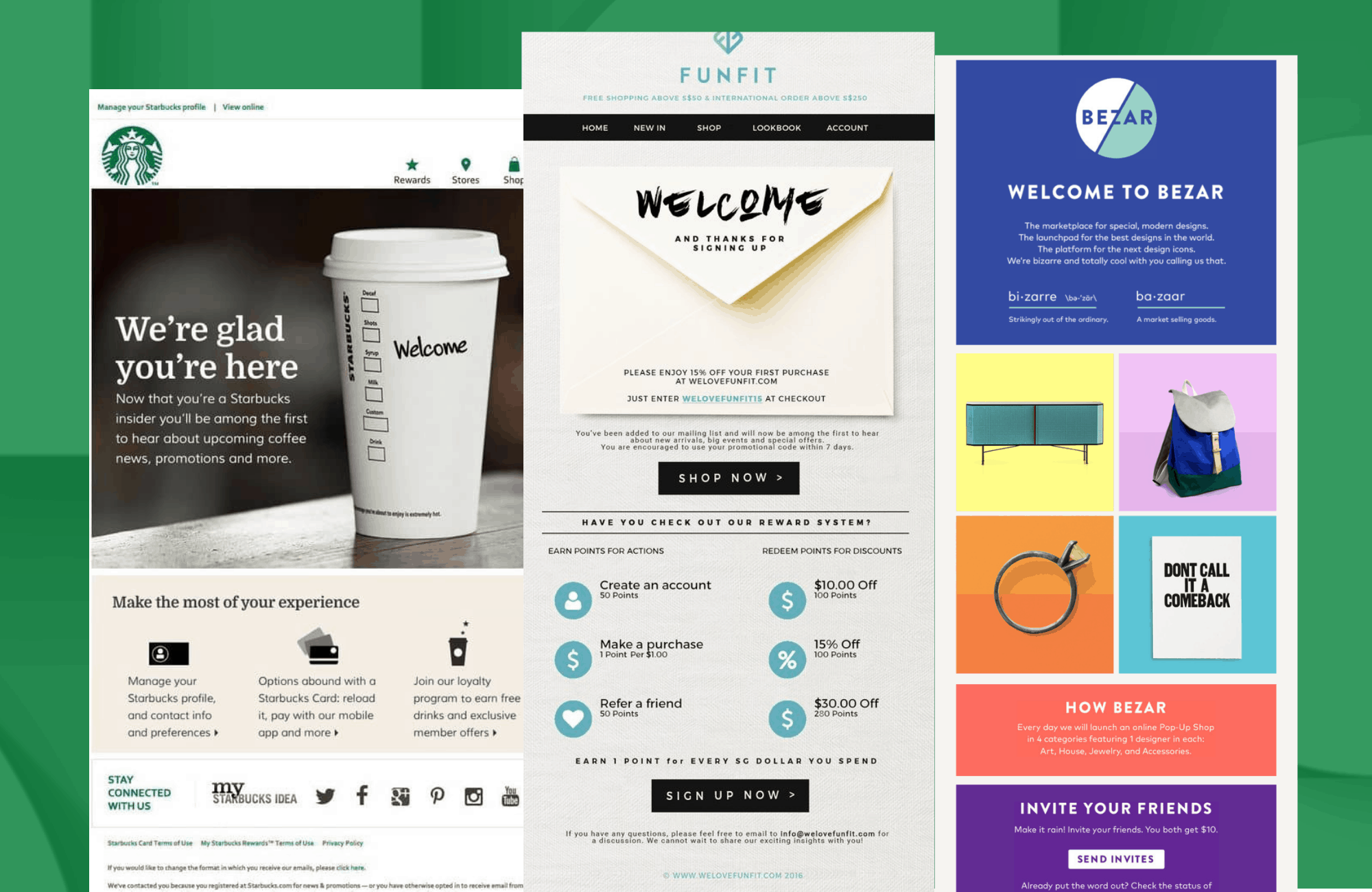
Bezar’s welcome email is bizarre…! “we’re bizarre, and we are cool with you calling us that.” They make themselves unique by using humor and making it their primary motivation. They put bizarre and Bazar into one word for their company ‘Bezar,’ making the customer feel unique in an utterly striking way. At the same time, this makes their market work well, making humor and the company’s motives go hand in hand. Also, giving the company’s brief introduction in just two words is quite creative. Bezar uses different colors, which makes the email look visually attractive. Colors are important because they carry meaning and evoke emotions. Colors tend to increase brand recognition by up to 80 percent. Asking your subscribers to invite your friend is a crucial element of a welcome email, and Bezar does it well by asking its subscribers to invite their friends by offering them 10$ each. It helps Bezar to expand its customer base even more. Specifically, it has a clear call to action where they mention if you want to “sell on Bezar,” “get in touch.” - Sephora

Sephora’s welcome email is beautiful. “Nice to meet you!” It’s a simple yet powerful line to greet your customers. At the same time, the email looks very feminine as Sephora’s main target is women who value fashionable/quality skincare, beauty, and fragrance products and are open to a medium to high price range. There are also sections with richly decorated cosmetics that appeal to pre-teens to young adults. These women love makeup and feel that it is a necessity. The subtle products in the background make the email look more attractive. It also has perks like a free birthday gift if you join.
Gifting your customers is always a great way to highlight your business’s identity and values. It also justifies five reasons why you’ll love Sephora, which indirectly makes the customer feel good about their purchases. It makes their customers feel like a priority by telling them they will first know about their new arrivals and special offer. Experience matters a lot in the case of Sephora because it’s a brand that targets pre-teens and women that use makeup daily. In matters of its welcome email, it has very generously put about its varied offers and discounts. Sephora is using the strategy to first win the customer confidence by educating them and solving their pain points. This way, they are going to have more qualified sales with high CLTV. - Canva
 Canva’s email design is straightforward, not much, but noticeable, there isn’t much they talk about in their design, but Canva’s welcome email guides the new users to series of steps to use Canva. It is obvious, so for the first-time user, it’s easy to navigate their way through Canva. All you need is Canva as it’s not just free but also easy to use. So just by using three steps, you’ll be able to create a good design making Canvas welcome email convincing, engaging, easy to use. It contains a preview text which specifies, “believe it or not, you got the power to create brilliant designs,” which is an excellent call to action. They convince a customer that you have the power to create and make people appreciate what you have done. Their CTAs are brightly colored, which tend to attract people’s attention as it also engages color-full visuals, which shows the capabilities of the platform.
 - Ikea

IKEA’s welcome email has a pretty emotional way to it by the headline that says ‘Join Ikea Family’ this same word Family makes a person feel like a member of IKEA rather than just another customer. It signifies a personalized welcome subject line like any of some awesome welcome emails should have. And very well then moves on to discounts and other perks, which people look for after being a part of a company; it uses the subscriber’s name to lead the impression as it is more personalized and builds trust between them the brand and subscribers. They have used multiple CTA’s, which in turn leads to IKEA’s landing page is also ‘scoops and sneaks’ that makes the customer feel crucial as only they know what’s happening inside the company. Every parent can happily shop when they know their children are given equal importance. That’s what Ikea has done. Therefore, IKEA stands out as an emotionally appealing brand, uses words, and well-structured email has made Ikea stand out. At the bottom of the email, they have provided links to all social media handles, which encourages subscribers to interact and know better about the company, which in turn also helps the company to build their social networking platforms. - Starbucks
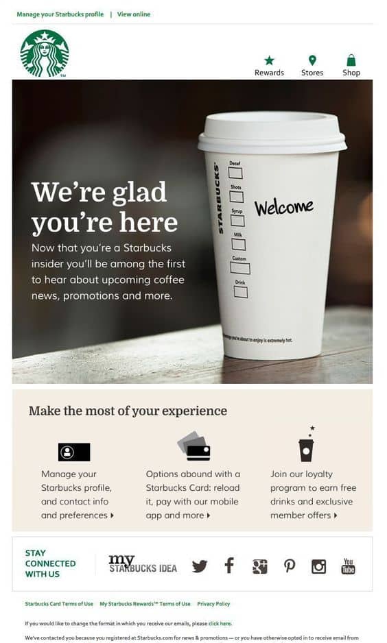
The Starbucks welcome email is simple but creative. The email’s divided into three parts. The first part includes the welcome message, “we’re glad you’re here” Starbucks is well known for personalizing their drinks by writing the customer’s name on the cup. They have genuinely put in some creativity by writing the word “Welcome” on the cup and say “We’re glad you’re here” the second part is about the customer’s profile, where they mention their profile, card, and loyalty program. In the third part, they encourage their subscribers to connect with the company on social platforms. Starbuck’s welcome email might not be the best but unique in its way. - Fun fit
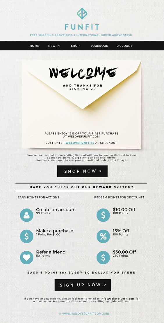
We write to remind people they’re unique. Handwritten letters are a classy friend’s game. A traditional approach of mails tends to make people happy and establish a personal connection as we are lost in a generation of electronic mails, and that’s what this email template tries to communicate with its attractive envelope design template having the important content “welcome and thank you for signing up” on the envelope itself. It also gives 15% off for customers on their first purchase. The email has a clear CTA to earn points and redeem for a discount. It also has a shop now button, which redirects subscribers to their website. - Sky Scanner
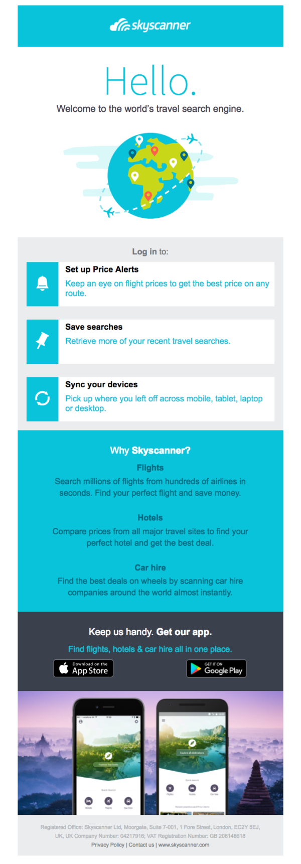 The sky scanners’ email design is quite decent and straightforward. Sky scanners welcome their subscribers by spotting themself as the world’s travel search engine. It lists its CTA directly without making its customers wait for any further instructions. It also justifies why they should opt for sky scanners that provide relevant information that subscribers should know about the company. It also calls on to download their app. They tend to follow a minimalistic approach as they used only two colors, keeping their design simple and functional.
 - Away Travel
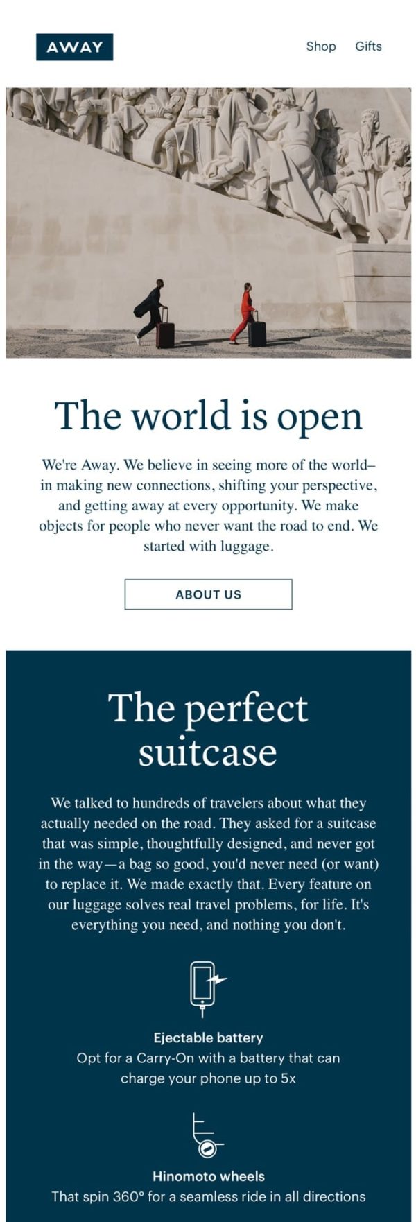
Not everyone is your long-term customer. That’s exactly why not all emails can be straightforward. Sometimes, you need to narrate a story to which your audience can relate. Away travels gives an outstanding mission of the company it’s very personally appealing, and it’s like telling the customers why it’s perfect, and the fact that they have researched what their customers expect and want from a luggage bag makes it even more appealing to the customers, its aim of improving efficiency, competitive advantage by adding a charging port in the luggage bag it’s like something everyone needs especially when traveling as they have mentioned every feature on the luggage solves real travel problems for life. - Moo
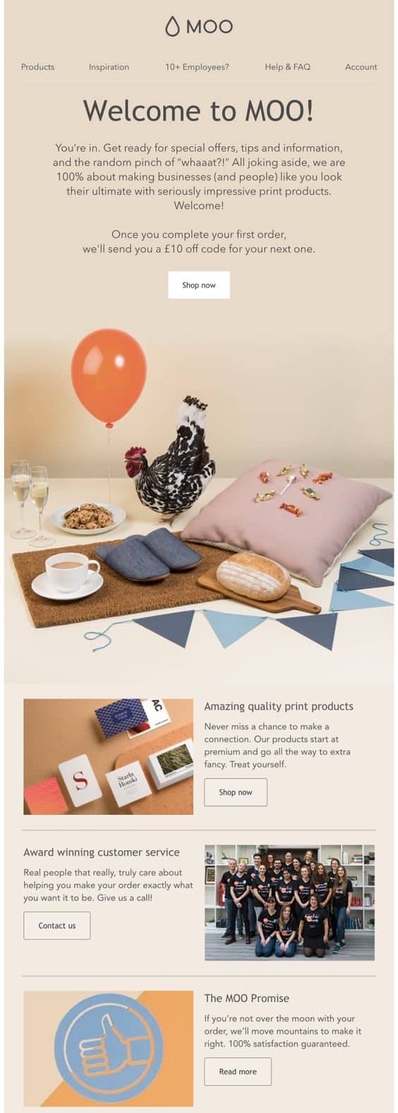
Moo is an online print company that is passionate about great design. The same reflects in their email, too, which is creative and beautiful. They use an attention-grabbing picture and color combination to convey their fascinating message. It brings up its quality print products with a very well visually oriented email marketing strategy that increases its engagement rate and has a clear 3 CTA for customers to shop now. Contact us and read more it mentions its award-winning customer service, which boosts expectations about a better experience with moo. Once you complete your first order, they offer you 10% off on your next order. It’s some of the tiny elements. An excellent welcome email should have in the end. Moo makes a promise, “if you’re not over the moon with your order, well move mountains to make it right,” and guarantees 100% satisfaction, which increases expectations to the next level. At the bottom, it has a link to its social networking sites, and the most important aspect it has a unsubscribe button down below, which is one of the top essentials of an email. It tells recipients how to opt-out of receiving future emails from you. The most important reason to keep the unsubscribe link is that it allows you to focus on subscribers who are interested in your content rather than those who aren’t.
After looking at the above emails, we should keep in mind that every company is different, and a customer’s mind today is constantly changing, and they want the best, so we as email marketers should not forget the basic tools to engage customers by just getting creative. When it comes to email, we should remember that ‘Creativity is the key’.
Conclusion
If you’re not having the right welcome email strategy in place, then probably you’re losing money on the table. Implementing the right series of welcome emails can easily give a minimum 2% boost to your business.

1 Comment.
Good content